Songflower -- reflowing sheet music to a different paper size
The problem
I wanted to have a look at Melodia, a public-domain textbook to learn sight-reading. I thought it would be nice to read Melodia on an ebook reader, but the available PDF is a scan of a paper copy in 7 by 10 inches, and my Kobo Glo screen is only around 3.5 by 4.8 inches:
The obvious solution is to scale it down, but it would be too small to read. So wouldn't it be better if we could split each page into parts of the right size?
Of course, it's not that simple. When reading music you want to follow the lines from left to right, then from top to bottom. It's exactly like text, where the right way to reflow a page is:
One way to do this would be to do optical music recognition to transcribe the whole partition, and then re-render it to the right format. But that's not so fun, and I don't know if there are good implementations for this task which I can easily install (i.e., not expensive and Windows-only programs). Instead, let's go for a more ad-hoc but much simpler approach.
To split music, you need to be able to recognize the separate lines (i.e., staves, or systems). Then you need to find a way to cut them: typically at a measure bar line, to avoid splitting inside a bar. More subtly, for the result to look good, you want each split line in the output page to have exactly the same length, even if the bars on the input page did not, otherwise the result will look jagged. The naive solution would be to stretch each line, but it will look awful and distorted. Instead, you want to do something like seam carving: scale the "uninteresting parts" (e.g., empty space on the staff) while leaving the "important stuff" (notes, alterations, etc.) untouched. See:
What's more, because scaling is undesirable, you need to decide where to cut among all the bar lines. The goal is to avoid having lines that are too small and need to be resized by a large factor (leaving too much empty space). The naive way is to fit as many bars as possible on each line, but this can leave you with very short lines that are hard to format properly. This is a variant of the word wrapping problem
The solution
So I wrote some code to take care of these tasks for me.
I called it songflower, as in
something that (re)flows songs. The code is here. I don't
expect it to be usable without significant tweaking, but there is a README and
some documentation that allow to play with it and tweak the parameters.
So what does it do exactly? Glad you asked. :) Here are the steps:
- Burst the input PDF into a collection of bitmap images, one for each page
- Split each page into one image for each line on the page (i.e., staves, or systems)
- Split each line into a chunk, i.e., a sequence of consecutive bars having
exactly the prescribed width. This involves:
- Finding the bar lines
- Splitting bars into chunks intelligently
- Stretching the chunks to have exactly the right width
- Combine the chunks into output pages (laying them out nicely on the page) and combine those into the output PDF.
The first step is easy with convert from ImageMagick, although
it is pretty long and for some reason and takes lots of RAM. The last step is
also pretty routine: you just greedily put as many chunks on each page as you
can, you need to compute the right spacing between the chunks to fill all
available height in the layout, and then combining the result into a PDF is just
convert again, plus pdftk. The harder steps are the
two middle steps:
Step 1: Splitting pages into lines
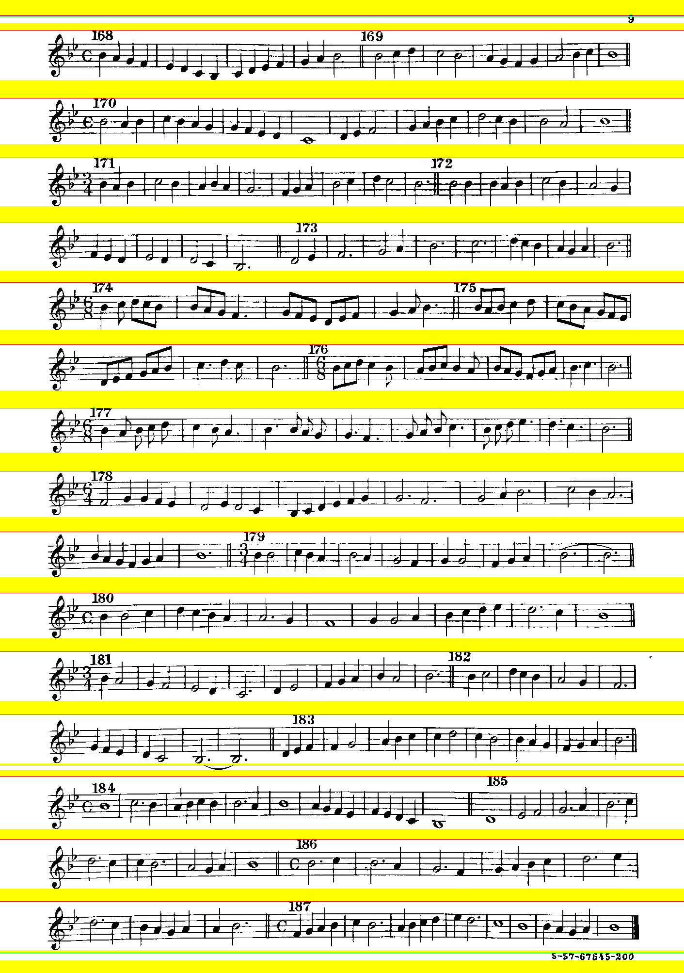
This step is comparatively easy. The program just looks for rows of the picture that consist mostly of white pixels. It then smooths this by merging together consecutive white lines that are sufficiently close (to have some resilience to noise). Last, it cuts at the largest sets of consecutive white lines, up to some threshold. This is how the program sees a page of Melodia:

The yellow lines are the lines detected as white space, and the red lines are where the program decided to cut (there were enough consecutive empty lines). The green lines were not used to cut because they yielded a line that was too short. The result here is pretty OK, except that the program was a bit too eager and cut away a tie connecting two dotted minims on the 4th staff from the bottom. Apart from small problems of this kind, the approach is pretty robust on the Melodia dataset. The main problems involve slurs, staves that are too close together on a page, and lyrics which often get removed (this is fine for my needs but it might not be for yours).
Step 2: Splitting lines into chunks
This is the trickier part. Let's focus on the first line above:

This is how the program sees it:

OK, this requires some explaining. The program looks at columns of pixels and computes two things: the height of the column, and the weight of the column (smoothed over a small window). The height is just the maximal vertical distance between two non-white pixels on the column, and the weight is the sum of the pixel's distance to black. We are especially interested in columns that both have a minimal height and a minimal weight (excluding some outliers, with some thresholds, etc). Intuitively, these columns are points on the staff where nothing is happening. These are the purple parts on the picture above: the cyan parts have small weight but not height, the pink parts have small height but not weight, and the black parts satisfy neither criterion. (Sorry, these ugly colors are just what was the easiest to produce -- it's a debug output.)
We can see that both criteria are useful: if we look only at the height (pink and purple) then we still include columns of staff that are not empty. If we look only at weight, then we get fooled by some columns that include part of a note (bars 2 and 3). But when we look at both criteria, the purple parts are a reasonable approximation of the parts of the score where nothing is happening. (Note that floating stuff, e.g., the numbers 168 and 169, prevent parts of the staff from being detected as empty.)
Now, it's good to find where nothing is happening, but where can we find bar lines? The idea is that a bar line is a part of the staff which:
- is of minimal height but not of minimal weight (pink)
- is surrounded to the left and right by points of minimal height and weight (purple)
- is narrow, i.e., not too many pixels wide
- contains a column with high weight, i.e., significantly higher (by some factor) than the weight of columns where nothing happens.
This is a complicated collection of criteria, but I didn't have luck with more naive approaches. My initial idea was just to look for columns having a minimal height and high weight, but this is fooled by note stems, e.g., of the last crochet of bar 3. Still, this criterion is fragile, especially with minims as their notehead is sometimes not heavy enough to be detected; and you have to set some parameters correctly.
On the example above, this approach correctly detects all bars (vertical lines), except the double bar at the middle. The blue bar is where the program decided to cut the line (to fit the width I had requested), and the red lines were possible cuts that were not used. Here the choice of a cut is simple (take the closest to the middle), but in more complicated cases the program will try all possible approaches.
The last thing to do is stretching the chunks to the left and right of the blue line so that they have the exact same length -- which they currently don't (the left chunk is much longer than the right chunk). To do this, the program simply scales all purple regions. We get this (without the colors):


It's not perfect: the first bar is a bit off, because the program did not stretch around the "168".1 Also, in a proper edition, the key would be repeated at the beginning of the second line, which my program doesn't dot, but well... Other than that, I think it's pretty seamless, and hard to notice that there was some work involved in bringing these two lines to the same width.
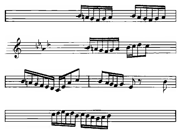
Of course, this example is a case where the program doesn't perform too badly. Sometimes, it has a harder time doing something reasonable:

One could think of more elaborate approaches to avoid problems, e.g., trying to identify floating things like "168" or lyrics or other things, process the staff without taking them into account, and then attach them back to the right place afterwards...
Wrapping up
There are a lot of corner cases and other subtleties in the code which I didn't get into. For instance, when the program doesn't detect enough bar lines, then it will fall back on cutting on spaces detected to be empty -- this is usually less disruptive. Performance is also an issue, as the code is in Python: to speed things up is, I use GNU parallel to process multiple pages and lines simultaneously.
Anyway: applying the process to Melodia, fixing a few glitches by tweaking the parameters on some pages (and adding a title, removing junk, etc.), I got the reflowed PDF I wanted. It's not perfect at all, and some of the later pages are quite wild, but well, I'll see to it when/if I get there. :)
You should be able at least to reflow Melodia to a different format by grabbing the code and running it. Other than that, I'd be happy to know if you have any luck applying this code to other files! I'm also interested in patches or ideas if you also find it fun to hack on this.
-
If you think the first bar of the second line is also a bit strange, look up: this specific weirdness comes from the original. :) I would say it's a success if the weirdness added by my code isn't so easy to distinguish from the weirdness that comes from the original engraving. ↩